Analytics Dashboard
Timeline: 5 x 1 week sprints Role: UXR / UXD / Interaction Design
The Problem
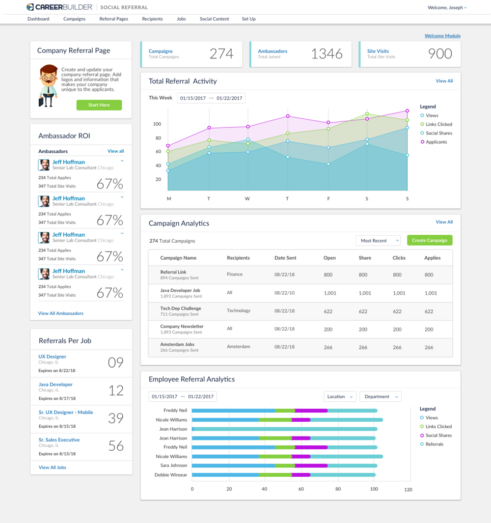
The Social Referral Admin Panel Dashboard lacks many data points that could create a better experience for the admin and product success. There are technical bugs living in the dashboard, as well as a poor UI of data points that users find frustrating. Admins have expressed interest in additional data points that could increase the success of Social Referral at their company.
In order to gain additional insights into client feedback, UXR reached out to the support team, product team and a few client-facing employees at Social Referral. To the right you will see the original dashboard before re-design.
Tools: Sketch, Invision Platform: Desktop Deliverables: hi-fi prototypes
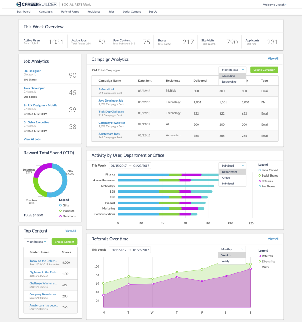
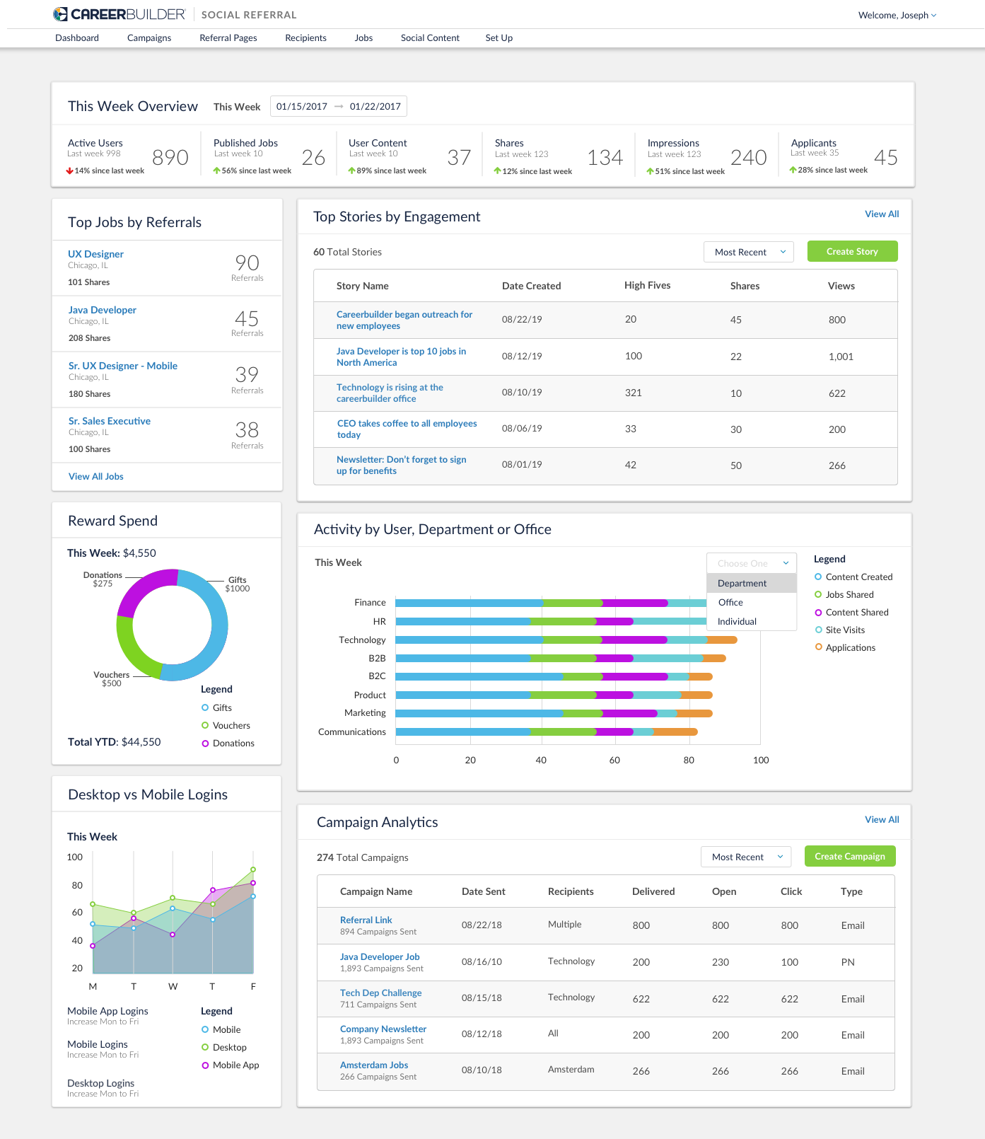
What’s the product vision?
Based on support and user feedback, the following points were made and this mockup was provided based on the collaborative conversation with Product, Support and User Experience.
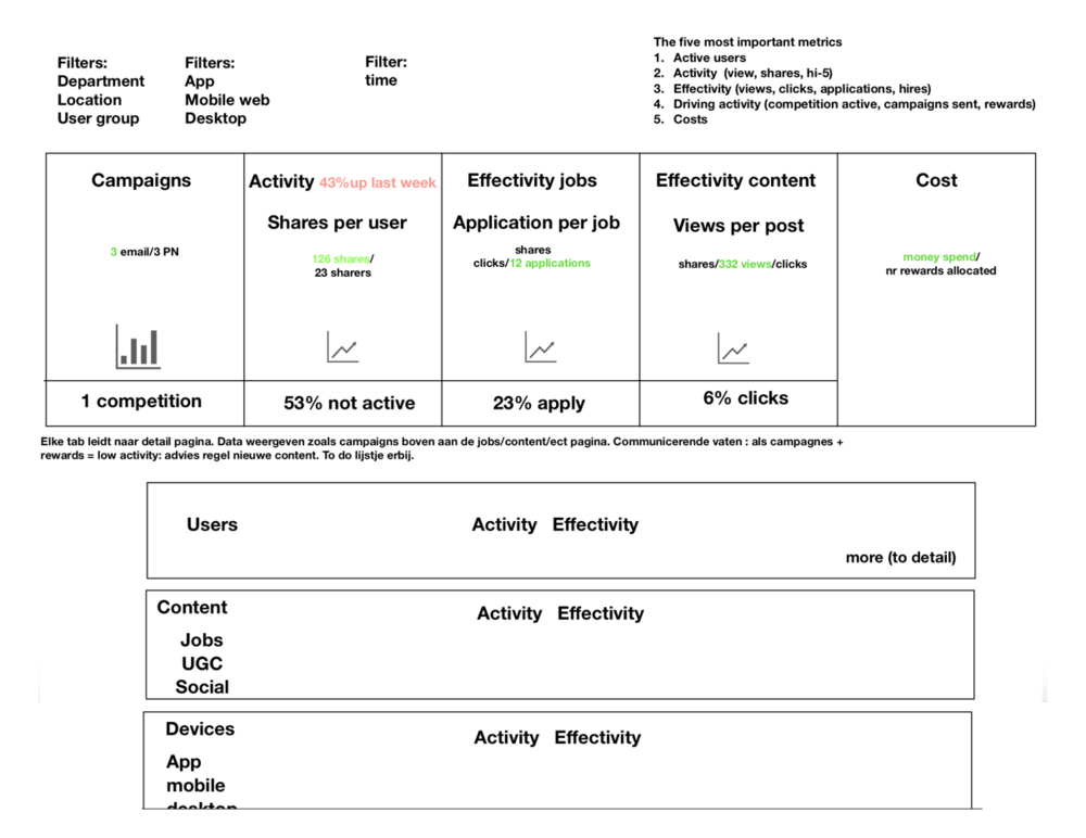
Timeline View: Users should be able to visualize from left to right the effectivity and what’s driving activity. Should include active users, jobs, shares, content, applicants, and site visits.
User Activity: Admins need to see their users activity, whose sharing, receiving referrals, receiving rewards, winning competitions. They should also see total content shares, job shares, site visits, applicants, and content created throughout the week. All data should represent a “this week” overview.
Content Activity: Admins should see the top stories, number of shares, views and high fives (perhaps percentage increase from last week to this week). They should also see the number of content created and content shared throughout the week.
Job Activity: Users want to see the top jobs by referral. UX recommendation is to also show job shares as well, so that admins can compare. They should also see the number of jobs created and shared throughout the week, potentially how many jobs are being brought into the system by other ATS’s.
Mobile vs Desktop: Users want to compare the usage between mobile and desktop so that they can send out additional campaigns and push notifications via desktop or mobile. Users also want to see this analytic over-time to see the top days that users are utilizing each so they can predict the best times to send campaigns versus notifications.
More detail: gain any additional perspective and feedback from clients in the short amount of time we have before release.
Design Iterations
After designing multiple iterations and creative thinking exercises, there were multiple different modules that could be important to the user. The overall goal was to incorporate one dashboard with the most important components for version one, therefore additional research was needed.