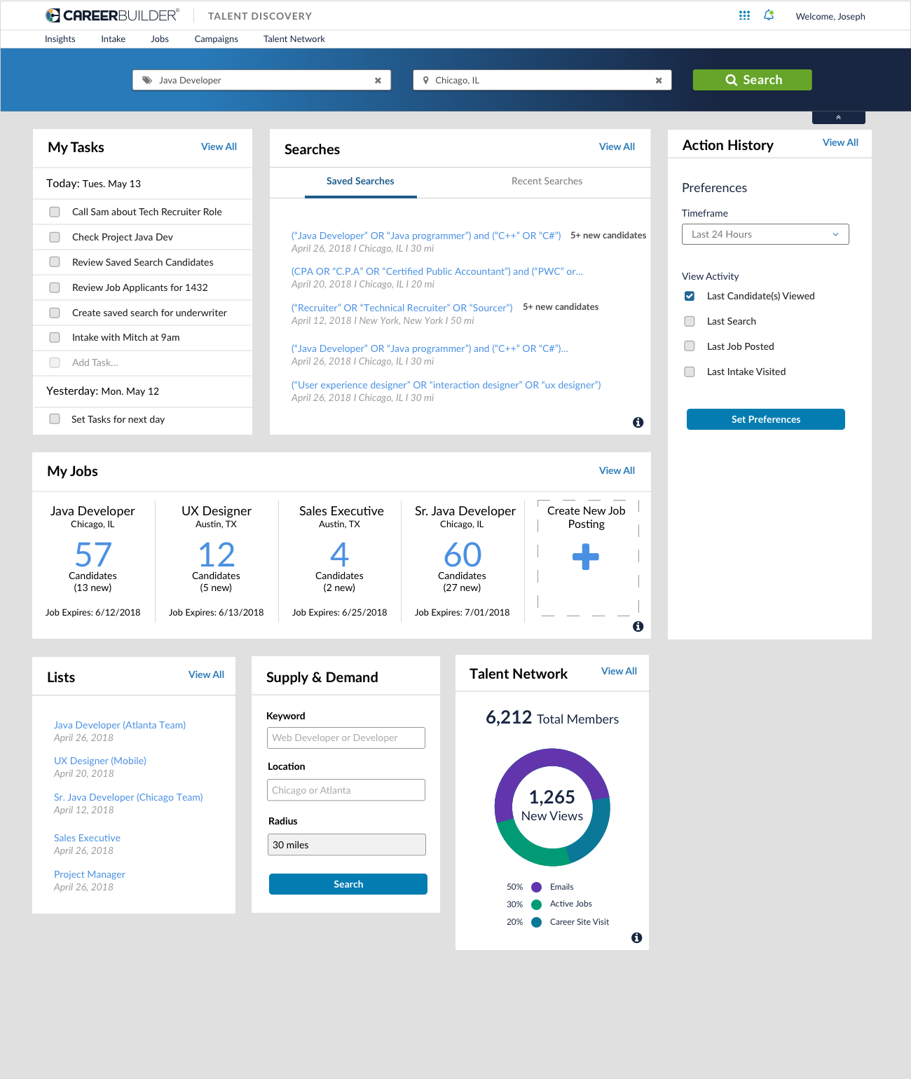
Personalized Homepage
Timeline: 10 x 1 week sprints Role: UXR / UXD / Interaction Design
The Goal
To create a destination homepage for Talent Discovery clients surfacing personalized and AI curated modules pulled from each feature of the platform, along with recommended activities based on the historical actions of each recruiter. CareerBuilder marketplace data will also play a role, to drive adoption and persistent usage of the platform.
The Research Plan
The goal is to understand what value points we can incorporate into our homepage to better assist recruiters with their daily workflow. We also want to gain perspective on usage patterns in terms of frequency of use and workflows of use, understand what friction points could be solved by a single homepage, and understand what modules are required for persistent use. Focus questions will be surrounded by notifications, alerts, top tasks, recurring tasks, and personalization of homepage.
Concept Research Hypothesis
Hypothesis 1 - Users will want to see notifications on the homepage including notifications about new applicants and new potential candidates. VALIDATED
Hypothesis 2 - Users visualize their homepage including their most important daily tasks. VALIDATED
Hypothesis 3 - Users want the homepage to include reporting and analytics on their own personalized information for filled roles, etc. NEED FURTHER RESEARCH
Hypothesis 4 - Users are checking tasks via multiple devices (desktop, mobile, other platforms). INVALIDATED (users use desktop unless checking email)
Hypothesis 5 – Users want a unique experience for their homepage. VALIDATED
Hypothesis 6 – Not all users will utilize the same modules, therefore, they will want the capability to hide modules. VALIDATED
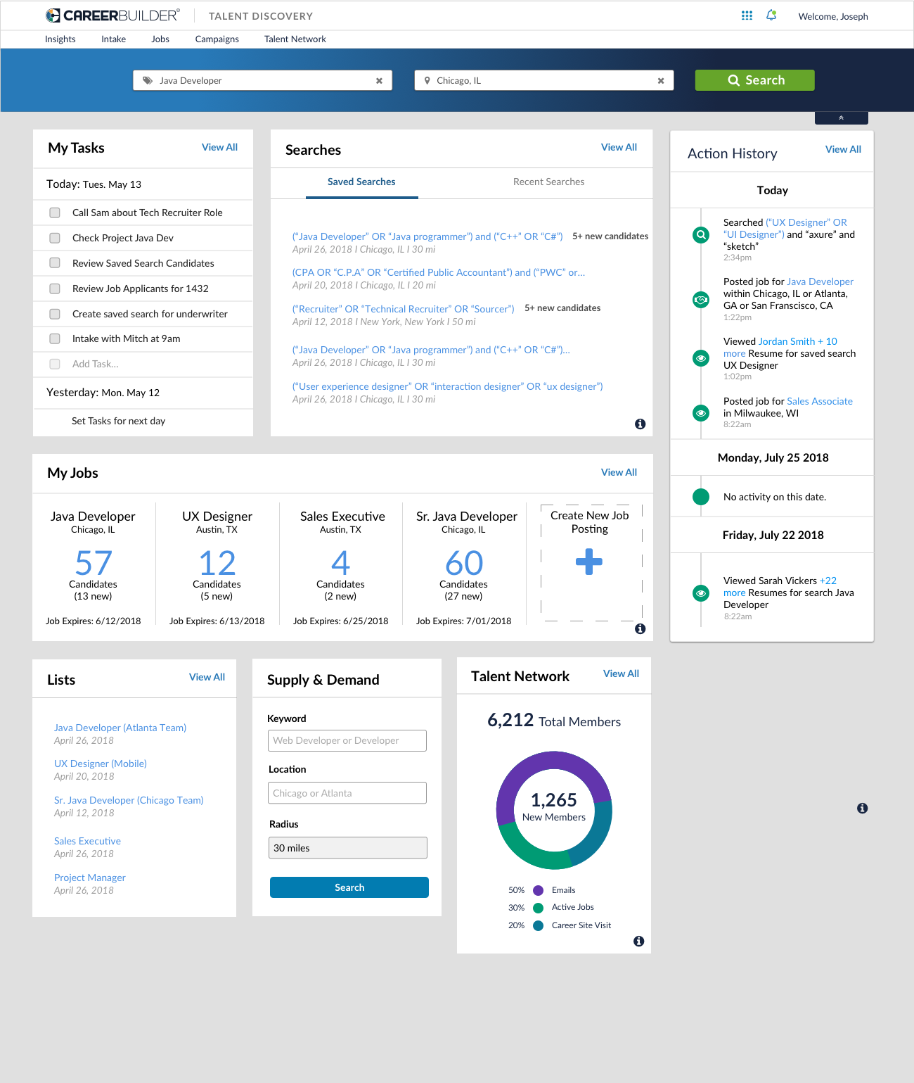
Action History Research
The three designs below were tested using the A/B testing functionality on usertesting.com. We wanted to understand if users had a preference on visual icons, bullets and colors. We also wanted to gain perspective on whether or not users wanted to see their lack of activity, hourly activity, daily activity, or weekly activity.
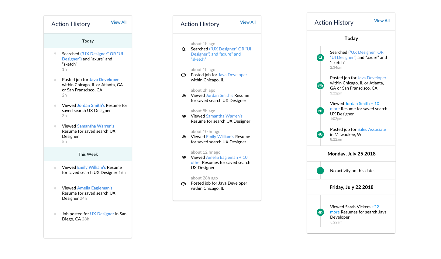
Action History Hypothesis
Hypothesis 1: Icons will help users make a quicker decision as to the action they last took. VALIDATED
Hypothesis 2: Users will want to see each individual candidate that they viewed for the day. INVALIDATED
Hypothesis 3: Users will want to see “no activity” on the days that they are OOO. NEED FURTHER RESEARCH
Hypothesis 4: Users will want to see time frame instead of hour stamp. VALIDATED
Hypothesis 5: Users will want to see date instead of today and week. VALIDATED
Hypothesis 6: Users will want to see each search they ran in their action history. VALIDATED
Hypothesis 7: Users will want to see their job posting actions in the actions log. INVALIDATED
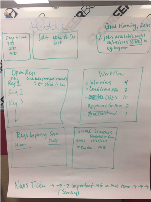
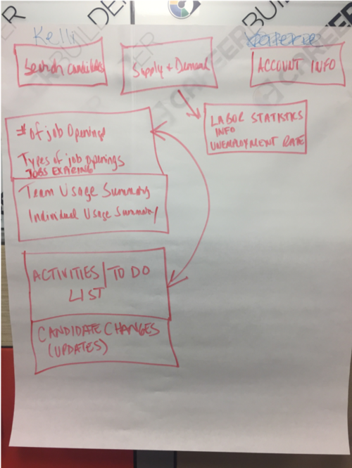
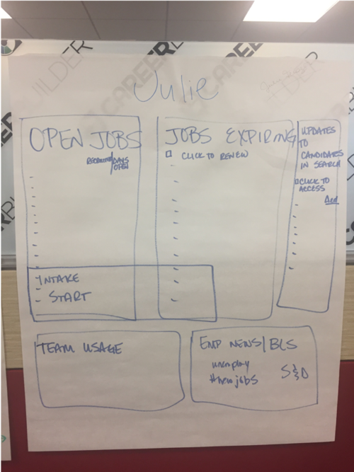
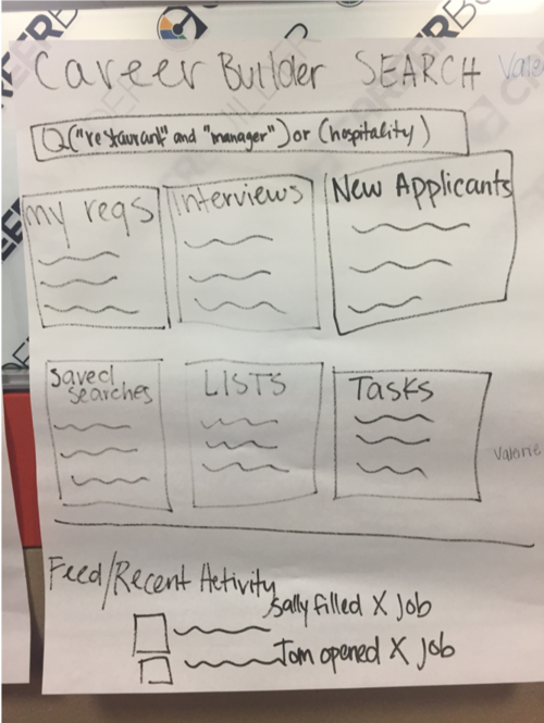
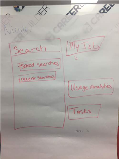
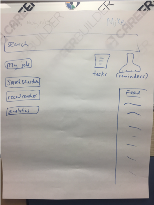
Focus Group Research
During a CareerBuilder Summit, we brought in multiple clients over a period of 3 days in order to test new concepts and gain insights into their homepage workflow. We asked clients to draw out their ideal homepage.
Research Findings
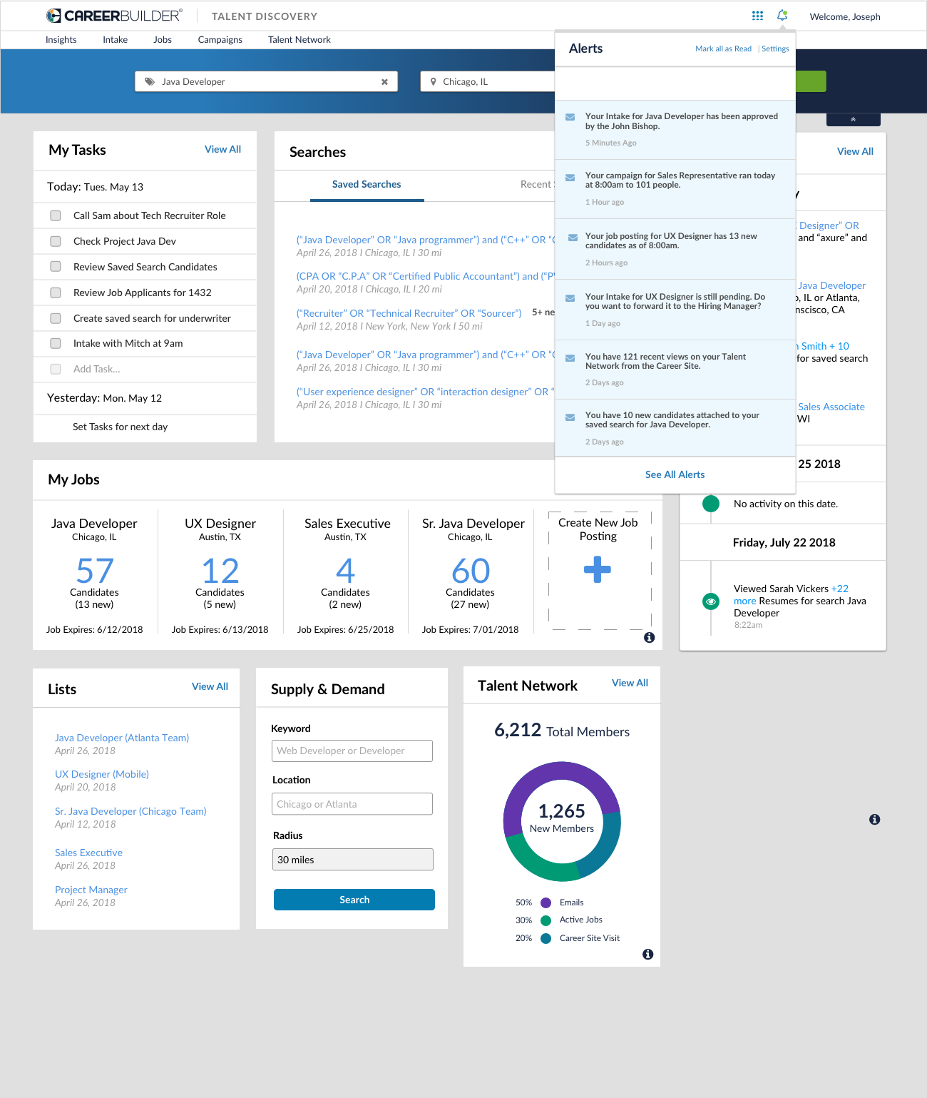
Users want to be alerted when: A Talent Network Candidate makes any update on their resume (email change, resume update), a new feature is implemented, a new applicant applies to a job posting if new candidates are tied to a saved search or a recent search. Users also want the ability to create tasks on candidates, view a list of their most recent activities, see a feed of information (jobs expiring, update of resume, etc.), and visualize their personal usage data. They’d also like the homepage to revolve around “search” including saved searches and recent searches. Lastly, if users have access to jobs, they’d prefer that this be on the homepage as well.
As for the action history, the design below ranked 1.6 points higher than the other designs. Users prefer the icons and dates with (day) included. Some users enjoyed the color brought to the icons. Once they saw the “no activity” within the design they found the value. Overall they liked the options to see “jobs, searches and candidates viewed”.
Recommendations
UX should design for a configurable dashboard (i.e. Apple Dashboard), provide all the necessary and needed modules and give users the option to configure their own (provide preferences for each). Product should consider discontinuing the “Search” Homepage, and combining every piece of the search homepage into the TD Homepage. We should also consider how will this look for RDB users if we discontinue the Search Homepage (lists, saved searches, recent searches).
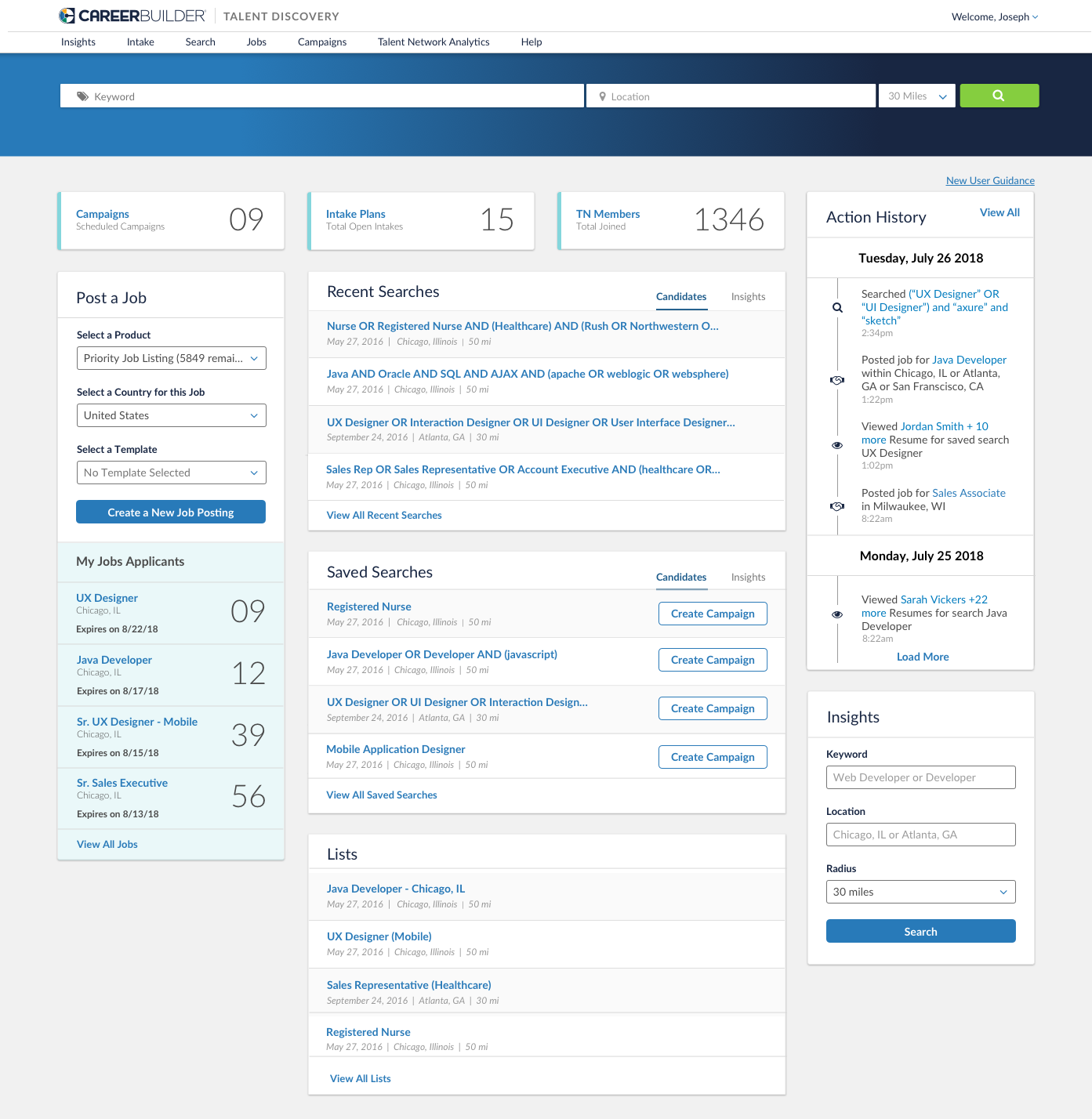
First Iteration
Below you can see each widget that was designed for the personalized homepage, these widgets were chosen based on user feedback. If you flow through the slides, you can see that the action history widget is flippable so that users can choose what they see on their homepage. You can also see the alerts that users would receive about candidate applications, job postings, and intakes.
Next Steps
Designs were shown to the development and product teams, to understand the scope of this project. Unfortunately, a few modules including alerts, talent network analytics, tasks, and activity history had to be de-scoped. Therefore, a second iteration of designs was necessary. However, Product Management did not believe that there was a value add for additional user research.